Stephanie asked me to expand a bit on the article on my web site, fredvanlente.com, which talks about how (I find) to best format a comics script. While there’s no standard method of comics script format, this is what I, a 20-year veteran of the industry (give or take), find works best.
I’ve been pleased to discover that once I posted free templates of the format on my website (here), that they became more widely adopted by more people who aren’t me than I could have ever imagined!
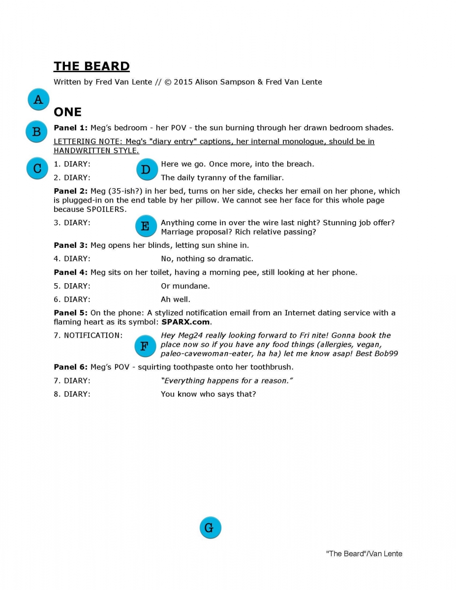
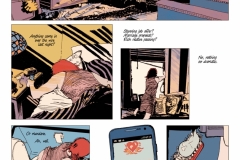
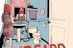
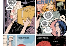
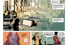
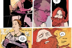
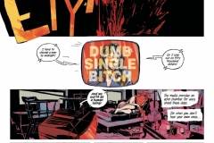
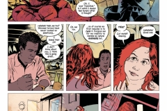
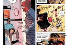
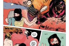
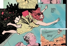
To give you an idea of how the format translates from script to finished art, here is “The Beard”, a complete short story I did with my friend Alison Sampson for the Broken Frontier anthology, side by side with the original script. I had the idea for the story, kicked it around with Alison on Skype to get her input, then wrote the script, with Jason Wordie and Thomas Mauer helping us out with colors and letters, respectively.
(WARNING, there are a lot of bad words in the script but only because Alison is terribly evil and made me. Ha ha, no just kidding I am a foul-mouthed reprobate who consistently embarrasses his mother. Be warned!)
[EDITOR’S NOTE: Scroll through the images in the gallery to see the full script. Click on any individual script page to make it bigger. The letters in the script correspond to the letters and explanation within Fred’s post. The finished script and how everything came together with Alison can be found at the bottom of the page. You can alternatively download the script for comparison to the notes here.]
Regardless of how you wind up formatting your script, these three principles are paramount:
- CLARITY
- CLARITY
- CLARITY
Oh, and also clarity.
Your script isn’t a finished work unto itself, but a blueprint from which some other, final product will be made. Most of the actual construction will be done by the artist. Hers is the most labor-intensive part of the process — DO NOT WASTE HER TIME BY MAKING HER FIGURE OUT ANYTHING OTHER THAN HOW SHE’S GOING TO DRAW WHAT YOU’RE ASKING HER TO DRAW.
Furthermore, in a lot of other instances (as is the case with “The Beard”) you’ll also be working with letterers and colorists, and sometimes, editors and inkers. All of them will benefit from a level of efficiency that would make Marie Kondo look like a meth-smoking hoarder (#topical).
To wit:

A) PAGE NUMBERS. All page numbers correspond to the page of the comic, not the script. In fact, the script itself doesn’t have any page numbers at all. It’s confusing when your collaborator says “I have a question about Page Seven…” and you’re like, “Page Seven of the script or Page Seven of the comic?” This way, everyone knows you always mean the comic.
B) Panel Numbers. I used to just do the panel number itself (“1:”, etc.), kind of like the page number, before Nate Cosby, when he was my editor at Marvel, suggested I add the word “panel” to set them off from the page numbers and the line numbers. He was right.
C) Line (or Balloon) Numbers: This is a bit of an anachronism. When I first got into the business about a decade ago, editors sometimes still did Balloon Guides for letterers, taking the pencils or inks and drawing right on them where they thought the balloons should go. They’d write the balloon numbers into the balloons instead of writing out the whole line. I had editors who’d still do this as of 2013 or 2014 or so, but it’s virtually unheard of today. I continue the practice more of out of force of habit.
Also, knowing the number of balloons keeps me honest. If you find yourself typing “20. CAPTION” start looking for dialogue to cut. Twenty balloons (counting SFX) on a single comics page is too damn many. Give the art some room to breathe, Talkypants!
D) Formatting Dialogue: Setting off the dialogue from the panel description is the most important function of any comics script, as it allows the artist, letterer, and everybody else recognize at a glance what is image and what is words on the page. Sounds like a no-brainer, but the less the artist needs to do to set off what she needs to worry about versus what the letterer worries about, the better.
E) Indents vs Tabs: Letterers often rant on Twitter with the hatred of a billion exploding suns about scriptwriters who offset their dialogue with tabs instead of indents. This is because they tend to cut-and-paste the dialogue directly from the script doc into the Illustrator file, and the Tab character will carry over into the paste, screwing up the alignment of the paragraph and forcing them to go in and delete the Tab, which makes them, yes I’m going to do it all-caps to remind you, WASTE THEIR TIME WHICH IS BAD.
My dialogue is indented at about 1.5” to 3” over, which is just enough to set it off from the panel description but without constricting it like, say, a screenplay, which just makes the pages too long. Technically that means the first line is tabbed, but the letterer can just move the cursor to the first letter of the line and not capture that first tab with it.
F) Size of Individual Balloons: My first editor at Marvel, the terrific Mark Paniccia, said that no balloon should be longer than three lines (indented like so). Anything longer should be broken up into two balloons (or even a third). This is more of a rule of thumb than an ironclad edict, nevertheless it is one I recommend all noobs follow.
G) Bottom of the Page: “The Beard” is good example of me being efficient with the script, which Sigmund Freud would say because I am trapped in the Anal Stage of Development. I try to keep scene description down to one sentence per panel, one script page per comics page, though that’s not always doable, or desirable. My editor at Platinum Studios, Lee Nordling, told me that more than once in his experience an artist had accidentally not drawn the last few panels of a page because their descriptions were on the next script page and he was only reading the script a page at a time. Which, um, you know, is not a smart way to be a comics artist, but hey, that’s why I am trying to Idiot-Proof these things for you people.
To counteract the (again, really bad habit of) Only Reading the Script One Page At a Time problem, a lot of writers put the number of panels at the top of each script page (i.e. “PAGE SEVEN (5 panels)”), but I think that’s a) ugly and b) because I revise a lot, the final panel count is the kind of thing somebody like me would accidentally screw up all the time.
So, instead, I put the word “MORE” in bold type at the bottom of the page, then put, “[PAGE NUMBER, CON’D” in the same big font size as the original at the top. I haven’t had an artist not draw the last few panels of a page yet.
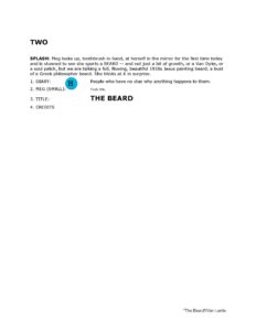
H) Parenthetical: These are specific directions to the letterer per letterer. I have several stock ones:
DOWN – i.e. the tail trails off to the bottom panel border for an unseen speaker
OFF – tail trails off left or right of panel to an unseen speaker
j – Short for “jagged,” i.e. it’s an electronic device like a cell phone speaking
What parentheticals should NEVER EVER BE are acting advice like you’d find in a stage play or screen play — “with a smile”, “defiantly”, “scowling,” etc. The acting is taken care of by the artist and therefore ALL visual description needs to be in the panel directions (B) above. The parenthetical (H) is for the letterer’s benefit only.
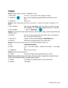
I) BoldItalics: Words you want the letterer to bold and/or italicized in the balloons should be and bold and/or italicized in the script. Do NOT put them in ALL CAPS because then any words that have I’s in them get turned into double-barred I’s in the lettering. The letter I SHOULD NEVER be barred except when used as a pronoun (or, sometimes, I use barred I’s when they’re the first letter of the sentence, but I think we have already established that I am anal and a weirdo.)
If you see barred I’s in the middle of comic book words that is a) a typo or b) a crappy comic. So you force the letterer to take out all the barred I’s after the cut-and-paste and that (everyone, all together) WASTES THEIR TIME WHICH IS BAD.
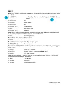
J) Ahhhhh a typo the shame, the shame.
K) It’s generally wise to capitalize a major character in his first appearance. I don’t do it with Meg, the main character of “The Beard”, but do what I say, not what I do, Grasshopper. [EDITOR’S NOTE: refer to PAGE SEVEN of the script in the gallery at the top of the page]
L) I very rarely call shots (“CLOSE UP,” “ESTABLISHING SHOT,” etc.) but when I do I try to cap and bold them as an extension of the panel number. [EDITOR’S NOTE: refer to PAGE EIGHT of the script in the gallery at the top of the page]
That’s pretty much that. Hope this was helpful — and you get a kick out of the 21st Century Fairy Tale that is “The Beard”.
If you’d like to be subjected to more of my writing wisdom, I am teaching an on-line class in Spring 2019 at Comics Experience on serialization and long-term plotting, and you can sign up for it here.
Also, my frequent co-writer Greg Pak and I wrote a book called Make Comics Like the Pros that takes you through the comics creation process from idea to scripting to pencilling to printing and marketing. You can get it here.
Good luck, and enjoy!
EDITOR’S NOTE: the pages below are the final pages by Fred Van Lente and Alison Sampson. Click on the first thumbnail to open the image to its full size and be taken through the gallery.
- Anatomy of a Comic Script - January 17, 2019
This was such an informative and enjoyable read. Loved to see how the script translates to the comic page!
Without a doubt this is super-valuable. Well written and much needed! Thank you!
Awesome! Thank you very much!