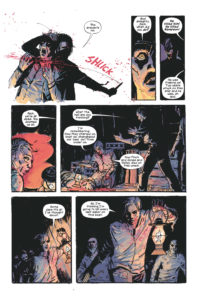
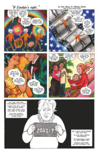
 We had a chance to chat with creator extraordinaire, Hassan Otsmane-Elhaou to ask him some questions about lettering and what his process is like.
Hassan is a comic book letterer on such works as Shanghai Red, Red Sonja, Lone Ranger, Peter Cannon: Thunderbolt, Black Mage, and more. He is also the Eisner-nominated editor of PanelxPanel, is a writer and filmmaker and hosts the Strip Panel Naked series.

What’s your lettering origin story? When did you first realize that lettering professionally was a real possibility for you?
I first got into lettering actually because a writer friend suggested I might be good at it, so I gave it a go for a pitch I was working on, and a pitch he was working on, and really enjoyed it. It was pretty bad, but I had some great feedback from another letterer who gave me some pointers, and I just did more and more work. People didn’t hate it, which I think was as good a sign as any. It’s not often that you fall into something and it feels right, so I decided to roll with it, and the more I did the more I loved it.
How old were you when you got your first works published?
Pretty recently for me in comics, I’ve only been working in them for a few years. So my first published thing was a self-published book when I was 26. I’ve had work made in other mediums before that, but yeah, for comics it was 2016.
What is one of the first lessons that you learned the hard way when you started lettering professionally?
That it’s not just the creative side that you need to know. It’s important to know some technical aspects, how things will print, how printing works, that sort of thing. Especially for indie books, I’ve found it’s usually the letterer who seems to be the one expected to know about the technical side, so it helps a lot to have a grasp on it. I don’t know that I learned it the hard way so much, but I definitely had a few learning curves early on.
Following up on that, what is something that you wish you had known about when you first started lettering?
That there’s a lot more that you can automate than I initially realised. There were some things I was still manually doing even not that long ago, that I know realised I could automate with a single button click. So anything you do regularly, like exporting files in multiple formats it multiple ways, I can create profiles for that much easier than I first realised! It saves so much time, too.

Hassan Otsmane-Elhaou.
What are some of the things that inspire your work and what does your lettering process look like?
Reading comics and seeing what other letterers are doing is always a big help. I love seeing what Aditya Bidikar and Rus Wooton are doing, Ariana Maher and Steve Wands. They’re always making me want to push what I’m doing, and think a little differently. My process is probably
fairly similar to others, but I like to work font-first, where I try and get word forms that look like they’d be drawn from the art itself, something that directly matches. Once I’ve settled on that, I go for word balloon stroke and style, and find most everything else comes naturally from that.
How do you go about selecting a font (traditionally or digitally)? How collaborative is this process?
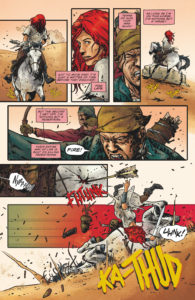
Different letterers work in different ways, definitely. I remember in the second issue of PanelxPanel we had Clayton Cowles talking about lettering Redlands, and a big thing for him was finding a font that suited the story and it’s horror vibes. I try to work towards finding a font that feels directly matched to the linework. Like in Shanghai Red, I wanted something a little loose and inky, something a little more handheld than normal, so I went with J Scott Campbell Lower, from Comicraft. It had the vibe that (to me) felt like Josh Hixson (Shanghai Red artist) would have hand-lettered it like that, matching his looser art.
For the upcoming Peter Cannon: Thunderbolt series, I looked at Caspar Wijngaard’s art and saw very much the digital quality of it, but it’s got a bit of attitude, too, right? So I wanted the lettering to have the same feel — kind of traditionally pretty neat, but with a bit of kick, so I went with Blambot’s Might Makes Right, which is a kind of classic superhero font with a little character.
How do you go about deciding what the word balloons are going to look like? How collaborative is this process?
For the balloons I go for the same approach, what kind of line or feel does it need from the art. Using the Shanghai Red example, I gave the balloons a handheld and inky look to match the art and the letterforms. For Thunderbolt, I kept the line a little inky to keep that character from the letterforms, but kept them a bit more structured (though still a touch of the handheld, I don’t like my balloons to look too digital overall).
Speaking of collaboration, how collaborative is working as a letterer? Is there a lot of communication with the rest of the team or do they tend to trust your decisions?
Completely depends on the team, really. Sometimes I’ll send over a few examples of style where I’m got a few different ideas, sometimes I’ve got a really clear idea of how I’ll letter someone immediately so go with that and send an example over, and see what the team think. I’ve
been lucky in that people seem pretty happy with the direction I want to go in. There’s only a few times when I’ve had to completely restructure the approach, and I like to think that’s because of the way I aim to sync everything up.
What are some essential tools you use in your lettering process? Any specific software?
Most letterers will use Illustrator, which is what I’m on. But I mix in a little Photoshop for doing hand-drawn sound effects, which I’ve been doing through Astropad on the iPad Pro so I can draw on the screen (my workaround for no Cintiq). And then there’s a little of Acrobat and InDesign for compiling proofs or book files, depends on what’s required. But mostly you can get away with just Illustrator.
Do you think the switch from traditional to digital lettering as standard has done a disservice to how people value lettering within comics?
I think it’s fairly expected, the way people think about lettering. Understandably people don’t think it has that dramatic an impact on what they’re reading, because its usually not so much specifically guiding the story, but that’s true only to an extent. I’d argue it’s maybe not so much just digital lettering but lettering generally?
What is the value of an artist lettering their own work vs. hiring a
letterer to do it?
From my previous answers you can see how I’m trying to replicate the artist, right? So I’d say if an artist was a good letterer, like they had a good idea for form and positioning and eye flow, them lettering their work vs. me lettering their work wouldn’t be much competition, because I’m just trying to figure out what decisions they’d make compared to me. That’s specifically hand-lettering or hand-balloon-ing though, I think, otherwise you’re asking an artist to be a great
artist and also developing skills as a great letterer, too. Does that make any sense? I think for all other situations, a dedicated letterer is the way to go.

What advice to you have for artists during the layout/linework process
so they can better account for lettering?
Add balloons into your layouts, and get a rough sense for how much space words take up. Accounting for balloons is always noticeable when you get finished pages in, and it makes the job much, much easier; So thank you to those artists!
What are some resources you would recommend for those wanting to letter comics?
For the technical side, I learned mostly from Jim Campbell’s blog and lettering tutorials, which are really great. They’re from a good few years ago now, but most of the principles are the same in the software. Otherwise just read comics and look at letterforms, look at sound effects, and see what decisions are being made on the page.
What’s one thing you’ve learned in your career that you think would be
helpful to others?
Remember that it’s a job, so understand time requirements and cost accordingly. That’s probably really obvious, but I think we all need a reminder from time to time…!
You can find more out more about Hassan by visiting his web site: https://hassanoe.co.uk/ and follow him over on Twitter @HassanOE.
- Pitching Your Comic Book: Pitch Outline Template (UPDATED) - January 17, 2023
- What To Include In Your Portfolio: A Guide for Comic Creators - December 12, 2022
- Networking and Building Genuine Connections - March 21, 2022
